Create a dark mode theme switch with Gatsby and TailwindCSS
Dark mode has been a recent feature in almost every technology. And in the release of Tailwind CSS v2.0, dark mode support was released as part of their feature.
While working with gatsby to create my portfolio, I couldn’t find an easy guide. But after so much research, I was able to come up with this solution. And I believe this solution will also help you to easily get things to build up.
Setting up the project
If this is your first time working with gatsby, you should run npm install -g gatsby-cli on your terminal to create a global installation on your computer. But I’ll also recommend that you visit gatsby’s quick guide.
Step 1: create a new gatsby project from the default starter
gatsby new dark-mode && cd dark-modeYour folder structure should look like this:
- src
  - components
    - header.js
    - image.js
    - layout.css
    - layout.js
    - seo.js
  - images
    - gatsby-astronaut.png
    - gatsby-icon.png
  - pages
    - 404.js
    - index.js
    - page-2.js
    - using-typescript.tsx
- .gitignore
- .prettierignore
- .prettierrc
- gatsby-browser.js
- gatsby-config.js
- gatsby-node.js
- gatsby-ssr.js
- LICENSE
- package-lock.json
- package.json
- README.md
Step 2: Let’s install and configure tailwindcss in our project.
To install:
npm run tailwindcssRun the below command to generate tailwind.config.js file
npx tailwindcss initStep 3: Install and setup gatsby-plugin-postcss. This is a tool for transforming CSS with JavaScript.
Run the below command to Install:
npm install postcss gatsby-plugin-postcssTo setup:
- Include the plugin in your
gatsby-config.jsfile.
module.exports = {
    ...
    plugins: [
      `gatsby-plugin-postcss`,
...- Create a
postcss.config.jsfile in your root directory and add the below in it.
module.exports = () => ({ plugins: [require("tailwindcss")],})Step 4: Let’s create our CSS file in a static folder
- Create a static folder in the root directory. In it, create a styles folder that contains our CSS file; let’s say
index.css
- src
- static
    - styles
- index.css- Include the below tailwind directives in your
index.cssfile.
@tailwind base;

@tailwind components;

@tailwind utilities;
Step 5: Let’s build out tailwind CSS
- Include the below script in our
package.jsonfile. This script will help to generate a fully compiledtailwind.cssfile in the styles folder
"scripts": {
    ...
"build:tailwind": "tailwind build static/styles/index.css -o static/styles/tailwind.css",- Now, run the below command
npm run build:tailwind- Finally, Include the build CSS file path in
gatsby-browser.jsfile
// Import tailwind styles

import "./static/styles/tailwind.css"
Yaay!, we’ve successfully configured our tailwind CSS with gatsby 🍿.
Next, let us make some changes, then we run our server
- Update
layout.jsfile to the below code.
import React from "react"
import PropTypes from "prop-types"
import { useStaticQuery, graphql } from "gatsby"
import Header from "./header"
import "./layout.css"

const Layout = ({children }) => {
   const data = useStaticQuery(graphql`
                  query SiteTitleQuery {
                        site {
                           siteMetadata {
                               title
                            }
                         }
                    }
                `)
return (
    <div className="bg-gray-600 text-white">
        <Header
          siteTitle={data.site.siteMetadata?.title || `Title`}
        />
        <main className="p-10">
           {children}
        </main>
      <footer style={{ marginTop: `2rem` }}>
             © {new Date().getFullYear()}, Built with{` `}
             <a href="https://www.gatsbyjs.com">Gatsby</a>
      </footer>
   </div>
  )
}

Layout.propTypes = {
   children: PropTypes.node.isRequired,
}

export default Layout- Run
npm starton your terminal to start the development server - You can now view the project on the browser with http://localhost:8000/
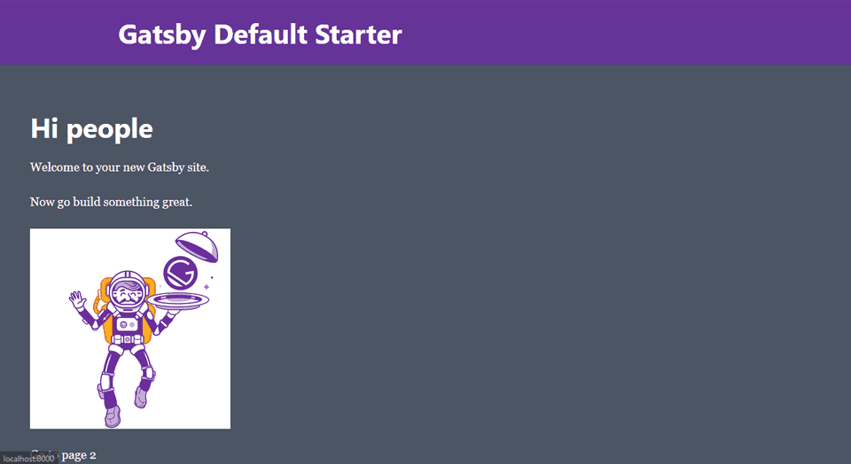
Your project should look like this:
Build dark-mode theme
Up till now, we’re yet to talk about our generated tailwind.config.js. Currently, you should have something like this:
module.exports = {
    purge: [],
    darkMode: false, // or 'media' or 'class'
    theme: {
        extend: {},
    },
    variants: {
        extend: {},
    },
    plugins: [],
}
Now, to enable darkmode on tailwind, set the darkMode option in your tailwind.config.js file to class. This will enable us to toggle the theme when dark mode is enabled.
Next, let us enable dark mode on our project
Step 1: Update the return statement in layout.js to this:
<div className="bg-gray-600 dark:bg-gray-900 text-white">
   <Header siteTitle={data.site.siteMetadata?.title || `Title`} />
    <main className="p-10 ">{ children }</main>
    <footer style={{ marginTop: `2rem`,}}>
       © {new Date().getFullYear()}, Built with{` `}
      <a href="https://www.gatsbyjs.com">Gatsby</a>
    </footer>
</div>
Step 2: There are two things to do here:
- Stop the running server with ctrl + c
- Rebuild the
tailwind.cssfile again. This will generate an updated file that includes classes like .dark:bg-gray-900
npm run build:tailwindStep 3: Install and setup gatsby-plugin-dark-mode. This plugin help to handle some of the details of implementing a dark mode theme.
To install:
npm install gatsby-plugin-dark-modeTo setup:
- Include the plugin in your
gatsby-config.jsfile.
module.exports = {
    ...
    plugins: [
        `gatsby-plugin-postcss`,
         `gatsby-plugin-dark-mode`
...- Create a
themeToggle.jsfile in your component folder and include the following in it:
import React from "react"
import { ThemeToggler } from "gatsby-plugin-dark-mode"

export default function ThemeToggle() {
     return (
       <ThemeToggler>
        {({ theme, toggleTheme }) => (
        <label> <input type="checkbox"
               onChange={e =>
                 toggleTheme(e.target.checked ? 'dark' : 'light')}
                  checked={theme === 'dark'}
               />{' '}

            Dark mode
          </label>

         )}
        </ThemeToggler>
     )
}
At this stage, the dark mode theme (via the prefers-color-scheme CSS media query) is automatically set.
Step 3: Import the themeToggle.js file in layout.js
import React from "react"
import PropTypes from "prop-types"
import { useStaticQuery, graphql } from "gatsby"
import Header from "./header"

import ThemeToggle from "./themeToggle"
import "./layout.css"

const Layout = ({ children }) => {
   const data = useStaticQuery(graphql`
                  query SiteTitleQuery {
                        site {
                           siteMetadata {
                               title
                            }
                         }
                    }
                `)
return (
    <div className="bg-gray-600 dark:bg-gray-900 text-white">
       <Header
          siteTitle={data.site.siteMetadata?.title || `Title`}
        />
      <ThemeToggle />
      <main className="p-10">
           {children}
      </main>
      <footer style={{ marginTop: `2rem` }}>
             © {new Date().getFullYear()}, Built with{` `}
             <a href="https://www.gatsbyjs.com">Gatsby</a>
      </footer>
   </div>
  )
}

Layout.propTypes = {
   children: PropTypes.node.isRequired,
}

export default Layout
If you’re currently at this stage, congratulation to you. We’ve successfully built a dark mode theme switch using gatsby and tailwind.
Now, Let’s test our project by running our development server again
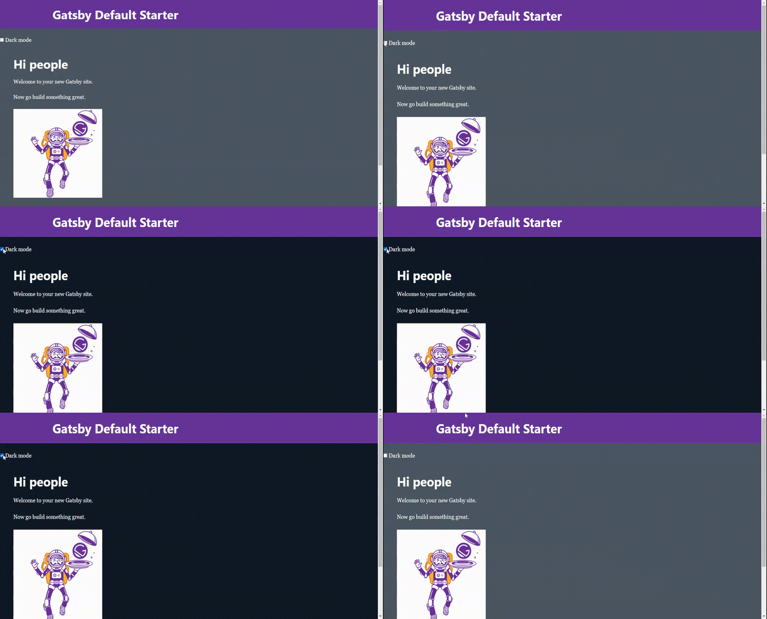
npm run startYeeeaah! ☺️, your project should look like this: ( please, don’t mind the file compression. )

Since this tutorial only focused on the functionality and not the styling, you can always be creative by making things look better.
I’ve provided links below, if you want to know more about the resources we used:
- Gatsby plugin dark mode: https://www.gatsbyjs.com/plugins/gatsby-plugin-dark-mode/
- Tailwind dark mode: https://tailwindcss.com/docs/dark-mode
--
You can like and do leave a comment for any contribution to this article on medium. Thank you.

